
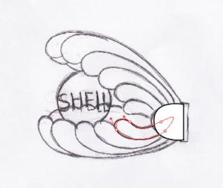
The logo I re-designed is based on both the company (Shell) and my nation (Iran).In South part of Iran, one of the most important businesses of local people is pearl buying and selling. This kind of occupation was common from ancient times. Lack of sufficient equipments caused lots of times for divers to go under and find pearls. But at the end they found something valuable and rare to find.
So, I made a connection. I considered that pearl is really worthy and precious as well as what the shell company has, petrol. Both of them, pearl and petrol are achieved from deep parts of the sea and are important for all. After all, pearls are made in shells.
At last, I used colors of Iran’s flag to make more relation between the original logo and my nation. The flag colors’ are arranged from top to the down in green, white and red. Thus, I colored the top part of the shell, green. The pearl in the middle is white itself and I used red color for the lower part. For the connector of parts I made the flag indirectly. So, my re-designed logo is ready.
 Now its the time to make the pearl.For that I made a circle and fill it with light gray,light blue and white GRADIANT.I choosed radial option and %60 opacity.Then I used TYPE TOOL and wrote the SHELL in the middle.
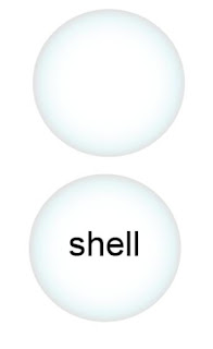 Now for better result ,make a copy of the pearl in front( Ctrl+C+F ).Now you have two pearl axactly the same .As the copy is celected choose DIRECT SELECTION TOOL and re-shape it in a way looks good to you.Then change the opacity of it.
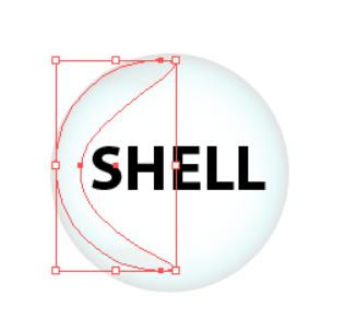 For the end of the pearl,first I fill it with black and then I pressed Ctrl+C+F.Now I have a copy of that exactly the same right on the former one.I celected the copy and used MESH TOOL.But here I worked with three points.I changed the opacity less ,over %50-%60,and re-shaped it to smaller form.so it seems that those colors are in the middle of the black.In this picture I sepreated them to show you the diffrence then you can put the ligher one on the black one.
