Finally I finished working on my logo.These are some steps I've done to create it.First of all I opened my sketch and tried to work on it with PEN TOOL.I made different layers for each part.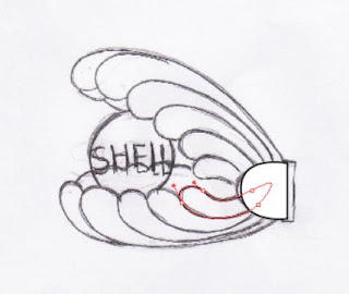

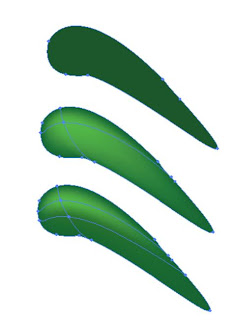
After I made all shapes with PEN TOOL,i colored each of them.Here I used MESH TOOL to show depth where its needed.I used a very simple way of MESH TOOL.First click on the layer of the shape and its area.Then choose MESH TOOl and click inside the area.The point you creat will be the centre of the color then you can choose your appropriate color.I used two points,one is a dark color and the other one is lighter.After all you can work on lines with DIRECT CELECTION TOOL.Thus shadows will appear in the way you like.
 Now its the time to make the pearl.For that I made a circle and fill it with light gray,light blue and white GRADIANT.I choosed radial option and %60 opacity.Then I used TYPE TOOL and wrote the SHELL in the middle.
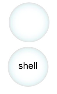 Now for better result ,make a copy of the pearl in front( Ctrl+C+F ).Now you have two pearl axactly the same .As the copy is celected choose DIRECT SELECTION TOOL and re-shape it in a way looks good to you.Then change the opacity of it.
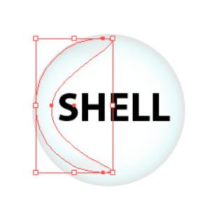 For the end of the pearl,first I fill it with black and then I pressed Ctrl+C+F.Now I have a copy of that exactly the same right on the former one.I celected the copy and used MESH TOOL.But here I worked with three points.I changed the opacity less ,over %50-%60,and re-shaped it to smaller form.so it seems that those colors are in the middle of the black.In this picture I sepreated them to show you the diffrence then you can put the ligher one on the black one.

0 comments:
Post a Comment